Pretty Pastels
3rd May 2016
Seeing new trends and colours come into the world of design and home interiors is one of my favourite things, especially at this time of year. We say goodbye to the darker colours and hello to nice bright tones. This year, I can’t help but notice that pastel colours seem to be making quite the statement! Adding in pale blues, pinks and greens, can really brighten up any room. So, if you feel like your room is too dark and dingy, the world of pretty pastel colours will soon help you out.
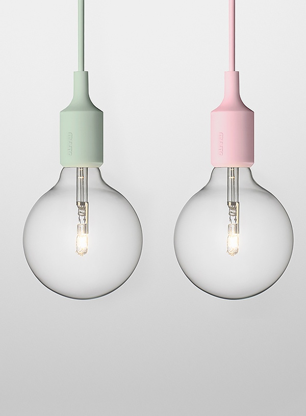
These simple bulbs topped in pastel colours are the perfect way to start adding some colour to your rooms. Simple, yet effective! Lights really help bring a room to life and I think these ones here would be a great way to start.
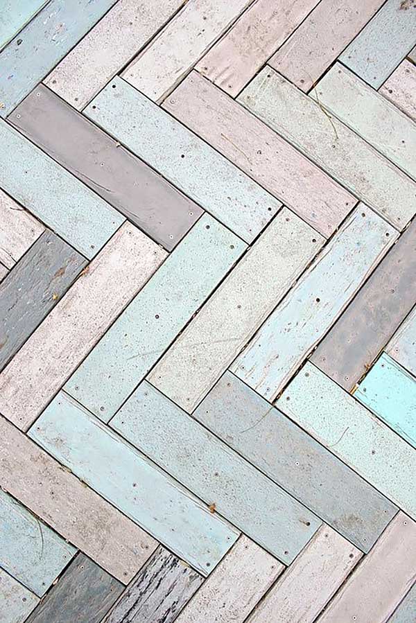
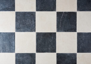
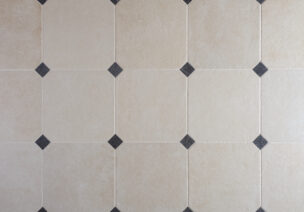
Obviously, flooring is an essential part to any room and I couldn’t help but fall in love with this floor when I saw it. It has the perfect mix of pastel colours with darker tones added in there as well. This floor is an example of a herringbone wood pattern with its very rustic nature, making for the perfect flooring full of pastel colours.
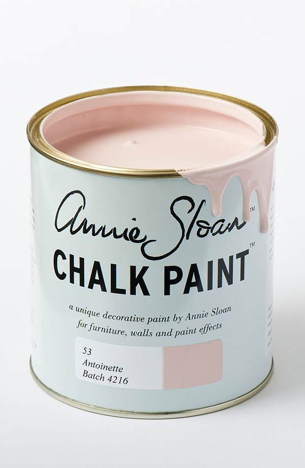
Finding the right paint can also be quite a challenge. Sometimes, there is just far too much choice and so many shades of the same colour, making a decision feel almost impossible. However, when it comes to pastel colours, I instantly fell in love with Annie Sloan chalk paint. I love the soft, pale pink colour, which is ideal for painting a range of surfaces. So, whether you want to restore some old furniture or decorate a room, it’s the perfect one to use.
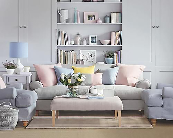
This sofa is just a perfect example of how you can mix the pastel colours together, to give a brighter feel to your living space. The use of a pale sofa, dowsed in bright coloured, pastel cushions really works and you can see why they are really on trend at the moment. Specifically, the mix of pale pink and pale blue seem to complement each other and they work so well hand in hand.
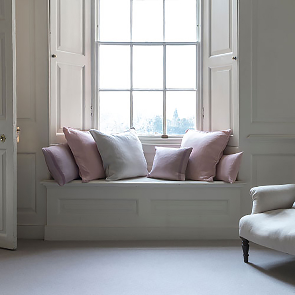
If you still do not feel confident with too many bright colours in one room, then here is a good compromise. It is quite common to stay in your comfort zone with more neutral colours such as greys and creams, so going from one extreme to the other, with bright pastel colours may be a bit of a shock to the system. But slowly adding in these pale tones will still add a sense of spring/summer into your room. Subtle changes work just as well by gently building up colour changes, rather than going for anything too drastic!
If you would like to have a look at any more of my inspirations, then please feel free to visit my Pinterest board where you can see all of my favourite home and interior ideas.
https://uk.pinterest.com/floorsofstone/mollys-inspiration/
All images taken from Pinterest.
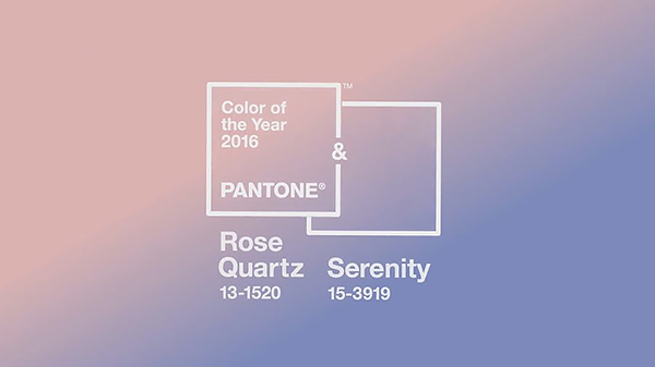
To finish off, I thought it would be nice to also mention Pantone’s colour of the year, which is probably where this season’s pastel tones have come from! We like to keep up with the latest trends here at Floors of Stone and it appears pastel colours are settling in very nicely. This year’s colour of the year is Rose Quartz & Serenity which is a nice balance of a warm, soft pink tone along with a cooler blue. These colours reflect tranquillity and peacefulness, which brings about a sense of happiness and well-being. It really is turning out to be the year of the pastel colours! So, what better time to add them to your own home? If you would like to find out more information about Pantone’s colour of the year, then follow this link to read more: http://www.pantone.com/color-of-the-year-2016